Plotting data on a Smith chart
This notebook focuses on:
Plotting points and sweeps (
ax.plot,ax.scatter)Styling traces (markers, lines)
Labels and legends
Practical patterns for frequency sweeps
Using
ax.annotateandax.text
[1]:
%config InlineBackend.figure_format = 'retina'

import sys
import numpy as np
import matplotlib.pyplot as plt

if sys.platform == "emscripten":
    import piplite

    await piplite.install("pysmithchart")

import pysmithchart
from pysmithchart.constants import Z_DOMAIN, NORM_Z_DOMAIN, R_DOMAIN
from pysmithchart import utils

text_box = dict(facecolor="lightyellow")
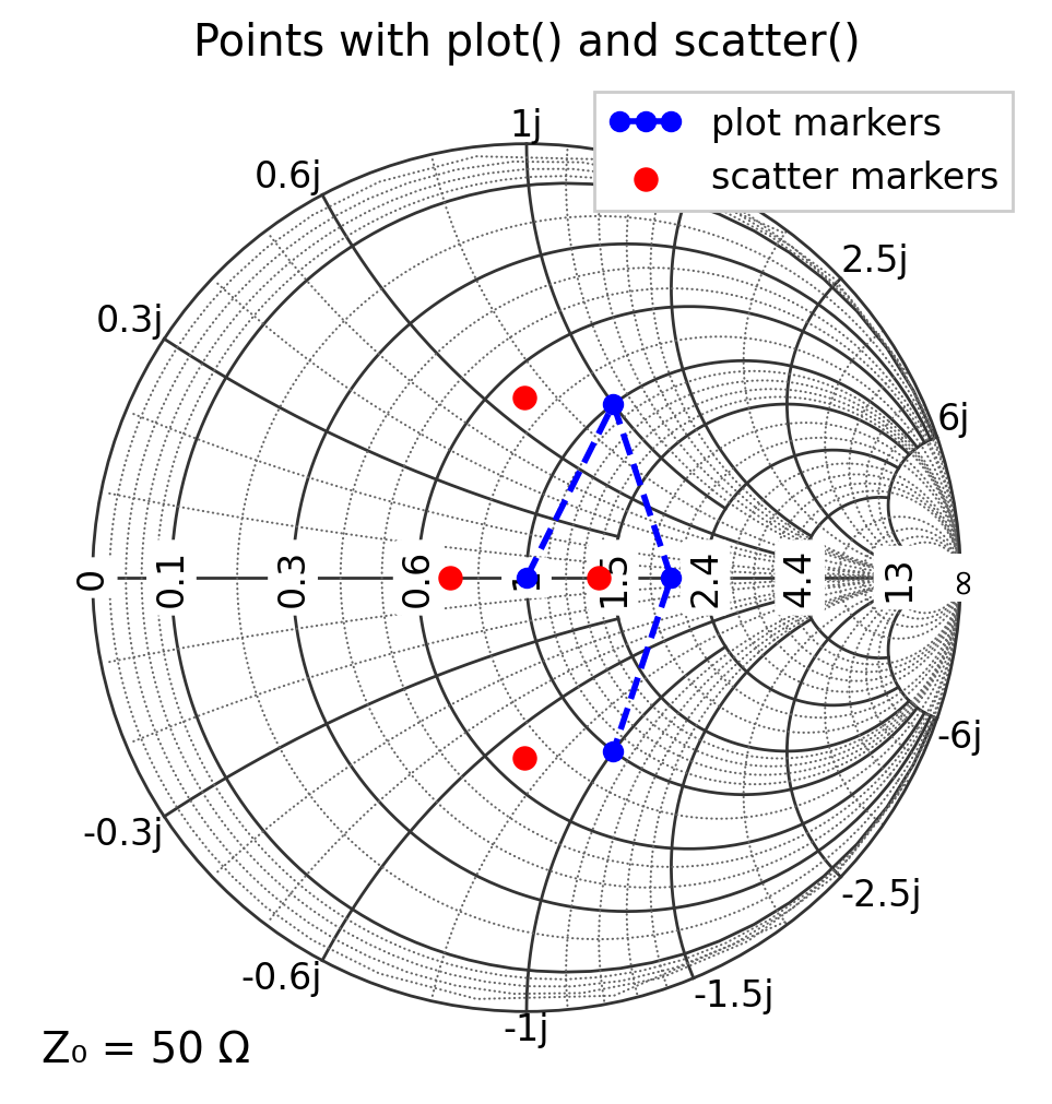
ax.plot() vs ax.scatter()
ax.plot(...)is convenient for lines and markers, and integrates well with legends.ax.scatter(...)is convenient when you want point-specific sizes or colors.
In both cases, you can pass complex data directly.
[2]:
Z0 = 50  # default
Z = np.array([Z0 + 0j, Z0 + 1j * Z0, 2 * Z0 + 0j, Z0 - 1j * Z0])

plt.figure(figsize=(6, 6))
ax = plt.subplot(111, projection="smith")

ax.plot(Z, color="blue", marker="o", ms=6, ls="--", label="plot markers")
ax.scatter(Z * 0.7, s=50, c="r", label="scatter markers")

ax.legend(loc="upper right")
ax.set_title("Points with plot() and scatter()")
plt.show()
What inputs does plot() accept?
Matplotlib (and pysmithchart) accept several common call patterns. All of the following are supported
Complex array
ax.plot(z_array)
ax.scatter(z_array)
Here z_array is a NumPy array of complex data points.
Separate real and imaginary arrays
ax.plot(x_array, y_array)
ax.scatter(x_array, y_array)
Here x_array and y_array are real-valued arrays (e.g., x = np.real(Z), y = np.imag(Z)), and must be the same length.
Single complex point vs single (x, y) point
ax.plot(z)      # z is complex scalar
ax.plot(x, y)   # x and y are real scalars
For single points, remember that plot() only draws markers if a marker is specified (see next section).
[3]:
Z0 = 50  # default
Z = np.array([Z0 + 0j, Z0 + 1j * Z0, 2 * Z0 + 0j, Z0 - 1j * Z0])

plt.figure(figsize=(6, 6))
ax = plt.subplot(111, projection="smith")

ax.plot(Z, "bo", label="ax.plot(Z)")
ax.plot(Z.real, Z.imag, "r:", label="ax.plot(Z.real, Z.imag)")

ax.legend(loc="upper left")
plt.show()

Points vs lines in plot() (format strings, markers, and line styles)
ax.plot() can draw lines, markers, or both. The behavior depends on the format string and/or keyword arguments:
'b'draws a blue line. If you pass only a single point, there is no segment to draw, so you may see nothing.'bo'draws blue circle markers (and no line if you also uselinestyle="").'b-'draws a blue solid line.'b--'draws a blue dashed line.'o'draws circle markers (default color cycle).
Convenient style controls for ax.plot():
marker size:
ms=10is the same asmarkersize=10line style:
ls="--"is the same aslinestyle="--"to draw markers only:
linestyle=""(orls="")to draw line only: omit
marker(or setmarker="") and keep a line style
The examples below illustrate a few common patterns.
[4]:
Z = np.array([50 + 0j, 50 + 1j * 50, 100 + 1j * 50])

plt.figure(figsize=(6, 6))
ax = plt.subplot(111, projection="smith")

# line + markers (explicit)
ax.plot(Z, marker="o", markersize=8, linestyle="-", label="line + markers")

# markers only (format string + ls="")
ax.plot(2 * Z, "b^", ls="", ms=8, label="markers only: 'bo' + ls=''")

# line only (no marker)
ax.plot(Z / 2, "b--", label="line only: 'b--'")

# single point: needs a marker to be visible
ax.plot(75 + 25j, "rs", ms=8, label="single point: 'ro'")

ax.legend(loc="upper left")
ax.set_title("plot(): controlling markers vs lines")
plt.show()

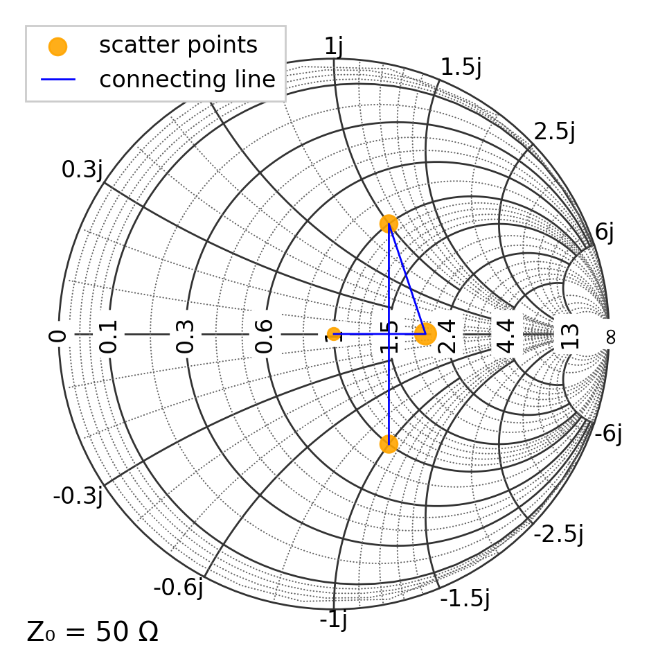
Marker control with ax.scatter()
ax.scatter() is marker-based and does not draw connected line segments). For some reason the controls differ from those ax.plot():
size is
s=...(marker area in points²), notmarkersize=...marker shape is
marker="o"(or"s","^", etc.)you can set transparency with
alpha=...
[5]:
Z = np.array([50 + 0j, 100 + 0j, 50 + 1j * 50, 50 - 1j * 50])
sizes = [40, 120, 80, 80]

plt.figure(figsize=(6, 6))
ax = plt.subplot(111, projection="smith")

# plot the points
ax.scatter(Z, c="orange", s=sizes, marker="o", alpha=0.9, label="scatter points")

# If you want a line through the same points, add plot() separately
ax.plot(Z, "b", lw=1, label="connecting line")

ax.legend(loc="upper left")
plt.show()
Traces: plotting a sweep
A very common workflow is a frequency sweep, where the impedance changes with frequency. A series RLC circuit has the following impedance
where \(\omega=2\pi f\)
[6]:
# Series RLC example impedance sweep
R = 25.0  # ohms
L = 150e-9  # H
C = 2.0e-12  # F

f = np.logspace(7, 10, 401)  # 10 MHz to 10 GHz
omega = 2 * np.pi * f
Z = R + 1j * (omega * L - 1 / (omega * C))

plt.figure(figsize=(6, 6))
ax = plt.subplot(111, projection="smith")
ax.plot(Z, "b")
ax.set_title("Impedance sweep")
plt.show()

ax.text() vs ax.annotate()
ax.text(x, y, "label")places text at a location (no arrow).ax.annotate("label", xy=(...), xytext=(...), arrowprops=...)is best when you want to clearly point to a feature.
Both methods use the same domain rules as plotting. If you ever need to be explicit, pass domain=... to the call.
Placing text independent of the Smith-chart domain
Sometimes you want text or annotations that are anchored to the chart frame, not to impedance, Γ, or any other domain quantity. In that case, use Matplotlib’s axes coordinate system:
ax.text(0.05, 0.95, "Annotation text", transform=ax.transAxes)
where (0,0) is in the bottom left corner and (1,1) is in the top right. This works regardless of the active Smith-chart domain.
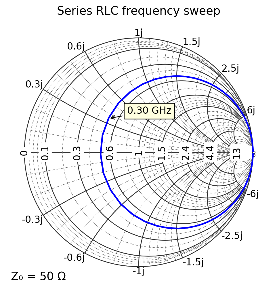
Labeling key frequencies
A readable chart usually labels just a few key points (start/middle/end or resonance). Here we annotate the first, middle, and last frequency points.
[7]:
def Z_rlc(f):
    R = 25.0  # ohms
    L = 150e-9  # H
    C = 2.0e-12  # F
    omega = 2 * np.pi * f
    return R + 1j * (omega * L - 1 / (omega * C))


f = np.logspace(7, 10, 401)  # 10 MHz to 10 GHz

plt.figure(figsize=(6, 6))
ax = plt.subplot(111, projection="smith")

ax.plot(Z_rlc(f), "b")

f = 3e8
Z = Z_rlc(f)
ax.annotate(
    f"{f/1e9:.2f} GHz",
    xy=(Z.real, Z.imag),
    xytext=(Z.real + 8, Z.imag + 8),
    arrowprops=dict(arrowstyle="->"),
    bbox=text_box,
)

ax.set_title("Series RLC frequency sweep")
plt.show()
Plotting in Γ (reflection coefficient)
If your data source provides S11, S12, or Γ values, you can plot it directly using R_DOMAIN.
Reminder: in this domain, values must satisfy \(|\Gamma| \leq 1\) to appear on the chart.
[8]:
f = np.logspace(7, 10, 401)  # 10 MHz to 10 GHz
Gamma = utils.calc_gamma(Z0, Z_rlc(f))

plt.figure(figsize=(6, 6))
ax = plt.subplot(111, projection="smith", domain=R_DOMAIN)

ax.plot(Gamma)
ax.set_title("Same sweep as above but plotted in the R_DOMAIN")
plt.show()

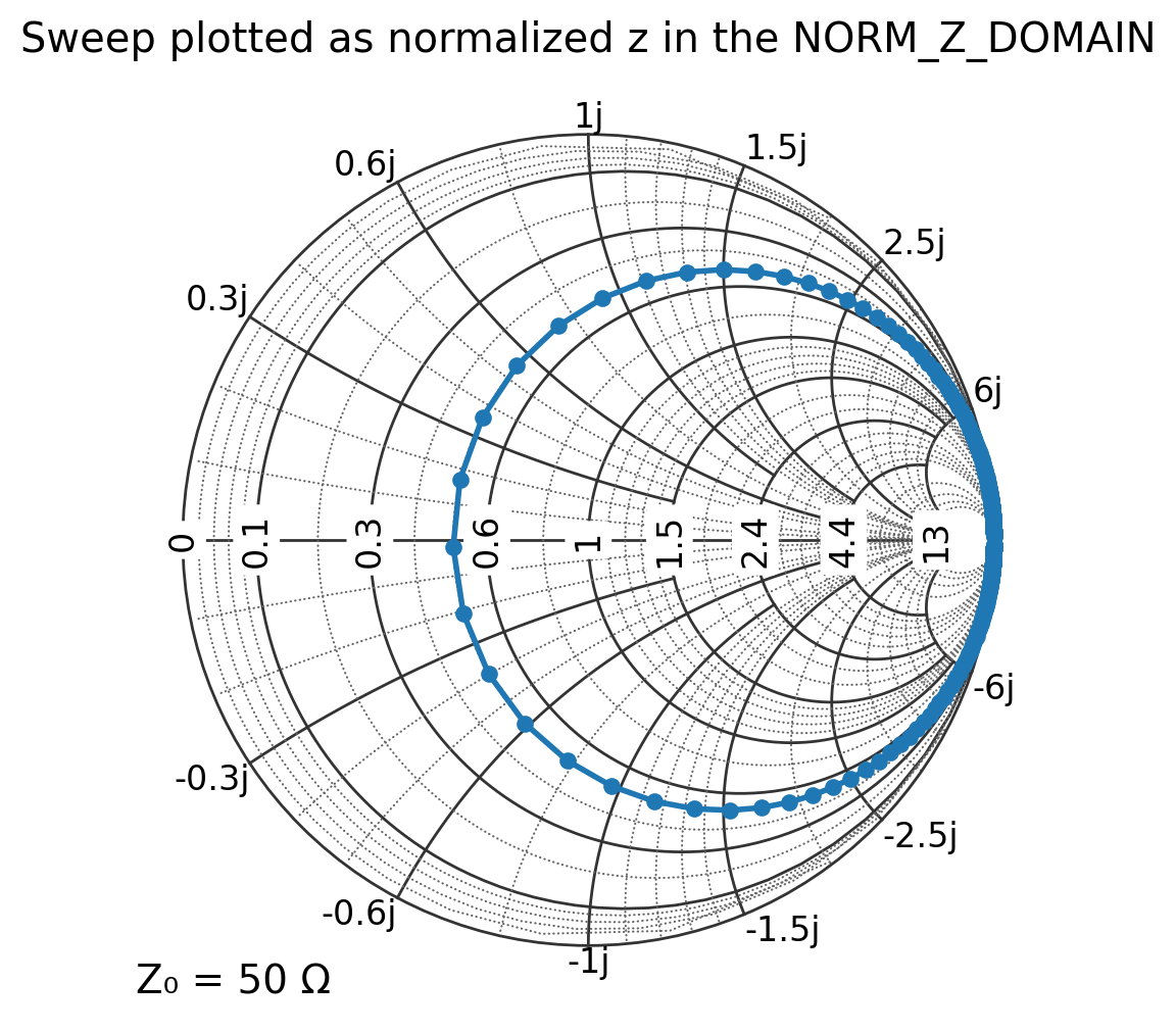
5. Plotting with normalized impedance (NORM_Z_DOMAIN)
If you already normalized your data (e.g., in a homework problem), use NORM_Z_DOMAIN and pass (z = Z/Z_0).
[9]:
f = np.logspace(7, 10, 401)  # 10 MHz to 10 GHz
z = Z_rlc(f) / Z0

plt.figure(figsize=(6, 6))
ax = plt.subplot(111, projection="smith", domain=NORM_Z_DOMAIN)

ax.plot(z, label="normalized z sweep")
ax.set_title("Sweep plotted as normalized z in the NORM_Z_DOMAIN")
plt.show()
[ ]: